Showing posts with label Kodak TMX 400. Show all posts

Monday, December 05, 2022

The Legacy Shuffle - One Way Around P.A.S.

Morning folks - been a while I know, however I have been a beavering away again and have only just found time to get into the darkroom. But it has been fine - makes one appreciate the finer things as it were!
Also, not just going in and banging off some prints has made me realise that P.A.S. (Print Accumulation Syndrome) can be largely pointless at my time of life.

A strange statement? 

Well not really, because there comes a time that one realises the mortal coil is moving on and at the end of the day, someone will have to deal with the tons of old prints and negatives you've shuffled away from and left behind. 
Oh yes, one can't beat facing one's own demise to sharpen the mind!


© Phil Rogers Dundee,Analogue Photography,Agfa MCC FB,5x4,Ilford Delta 100,Kodak TMX 100,Kodak TMX 400,Kodak TXP 320,Black And White Printing,Archival Processing, Archival Storage
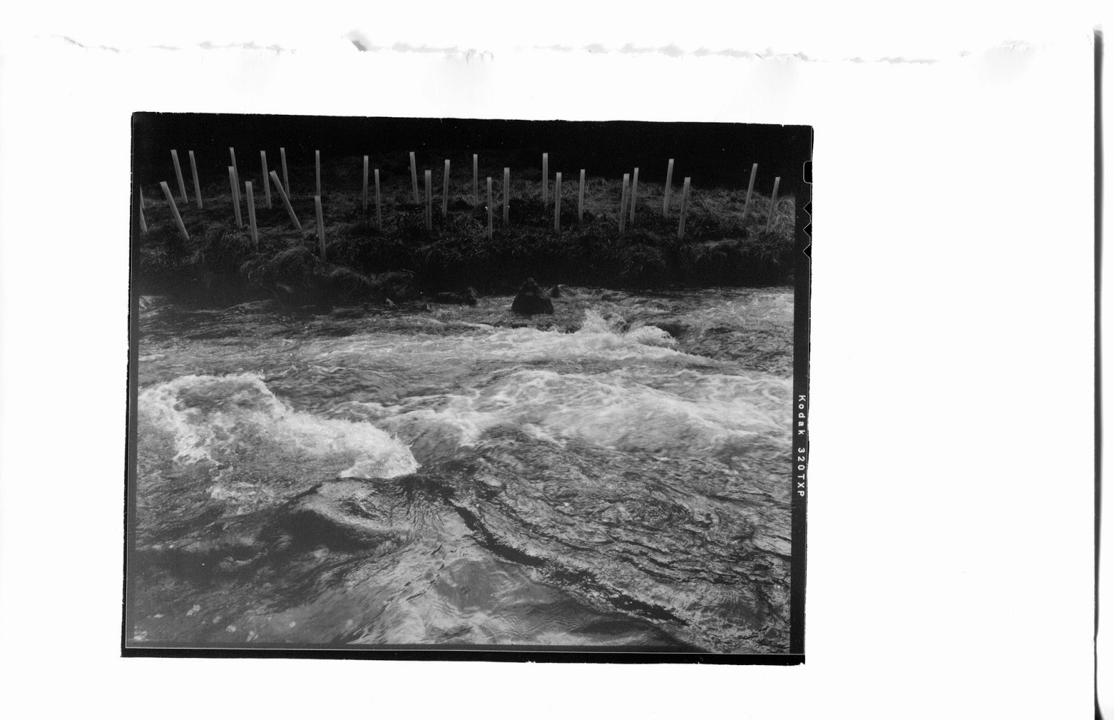
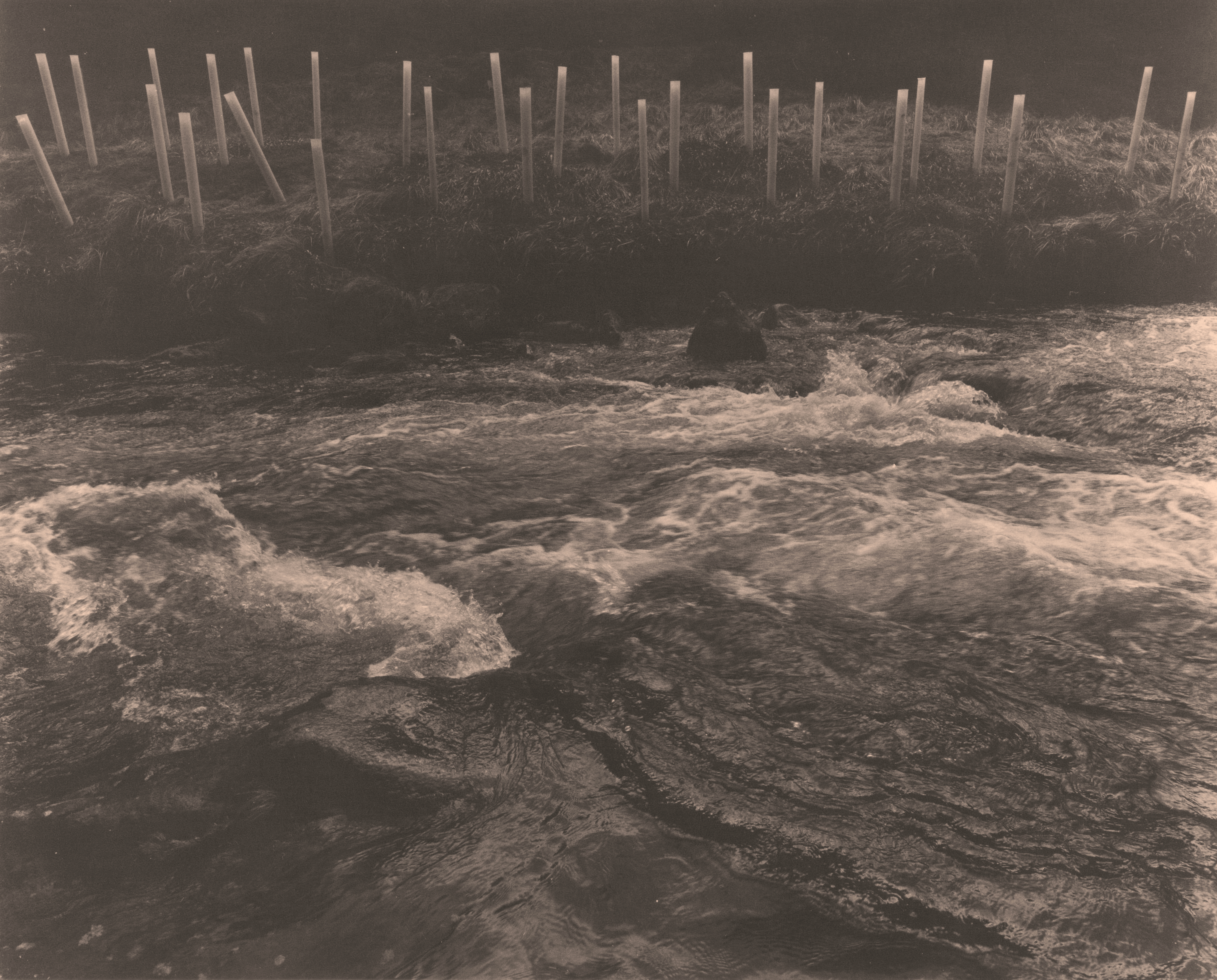
The Late, Great Agfa MCC
Archivally processed
Selenium toned
5x4 Kodak TXP Negative


Luckily I sorted out my negatives years ago. 
It was time-consuming, but simple and ultimately useful in the long run too. 
Am I looking for an image I remember taking a couple of decades back? 
Well, that is easy, refer to the contact print, look at the corresponding details that are written on the back, search through appropriate negatives and bing, you're there.
Shooting across multiple formats as I have done over years meant that rather than just having a big mass of negative sleeves and no idea, I spent a bit of cash and got organised. 
First things first, divide negatives into formats. 
Sadly if you've not written the date on the negative sleeve, you've got a problem right off. You'll need to stretch your mind (if you can be bothered) however it is worth it
I tend to number my films in the following manner:

35/001 (for the first one) and progress from there. Luckily I have detailed in notebooks which camera I used, where it was and the date. I then ALWAYS make a contact print of said film and file them away chronologically (and notated on the back) in boxes (old 8x10 paper boxes) for the format, which is clearly marked on the outside: 35mm Contacts 35/001 to 35/999 (whatever number of contacts are in there).

Then there's 6x6, so 66/001 - same procedure as above. Brief dalliances with a 6x9 box camera and the two 6x7 cameras I have owned are marked 67/001 and 69/001. There is a slight twist to the 66 ones - I now have a 645 back for the Hasselblad, so that is lumped under 66, however notated 66/333/645/1 (meaning the Three Hundred and Thirty Third 6x6 negative set, but the first 645). 
It makes sense to me
Again, they are all contacted and filed away.

5x4 negatives are treated in exactly the same manner.

I store my negatives separately per format too - it just makes things so much easier. 
The boxes I use are the clamshell CXD ones which have a solid 4-ring binder system in them - they're not massively expensive yet are extremely sturdy. 
The negatives themselves are stored in either Print File or Clearfile Archival sleeves. 
I really hate glassine sleeves simply because you cannot see what is going on without removing the negatives from them - plus, if you've got an accidental wet hand in the darkroom and are trying to remove a new negative, the glassine can become difficult to say the least.

And that's yer negs sorted! 
Easy eh. 
It does take time, but in my humble opinion it is time well spent, especially because it will force you to re-examine your own archive. Believe me, you have some gems in there!

One thing I did a few months back was join (well, not really join, more turn up and introduce myself!) the Photography Forum at Dundee's DCA. 
It is a loose collection of really good photographers, all with their own take on things and, every month, some truly surprising and enjoyable images. 
From my own point of view it has made me focus on what I am going to take along, and this in turn has made me go a huntin' through Ye Olde Negatives And Contacts to find something to print. 
This is a good thing.
Now I could just be going through the old piles of prints searching for chiff chaff, however now I have a point of focus I want to print new stuff
Not only that, but a lot of those old legacy prints, are, to coin a common parlance . . S.H.I.T.E. 

Printing is a life-long learning experience
There, that is that out of the way.
Aside from the life-enhancing qualities, it is also fun, however it can often be utterly frustrating and demanding (weirdly both physically and mentally) but at the end of the day it beats hanging about on the corner with the lads, smoking tabs and drinking beer.
Also (despite what you've probably seen written or vlogged to death) it need not be complicated
In fact, it can be as simple or as complicated as you like. 
A lot of beginners feel they need to dive deep into split-grade/lith/f-stop timing/analysers etc etc etc. Well, I'm here to tell you, YOU DON'T.
Actually, you don't need much more than the bare basics:

Enlarger (or controllable light source if you are contact printing)

Easel (always handy but masks made from card, or print corners held down with masking tape can suffice)

Grain focuser (I used to poo poo these, but as my eyesight has got worse, completely rely on one  - the wee Paterson Minor is a good place to start)

Four Trays (or more - they're always handy) 

Jug and measuring receptacles (I use cheap jugs from hardware shops - they last for years)

And that is it. 
Your darkroom doesn't even need a dedicated water source
Certainly it is handy, but for myself, I don't have one and get along fine. 
You use a tray as your print washer. Dedicated print washers are expensive though handy, but until you feel you need one, it is easy enough to wash in a tray under a slowly running tap or steeping the print in multiple changes of water. 
If you're printing with RC paper, washing does not take long; if you're using fibre it will take longer, however any of the wash aids (Ilford, Kodak etc) used before washing drop the time dramatically.

SIMPLE.


© Phil Rogers Dundee,Analogue Photography,Agfa MCC FB,5x4,Ilford Delta 100,Kodak TMX 100,Kodak TMX 400,Kodak TXP 320,Black And White Printing,Archival Processing, Archival Storage
The Late, Great Agfa MCC
Archivally processed
Selenium toned
5x4 Kodak TMX 400 Negative


All the scans in this post were produced from prints made with the bare minimum of equipment - albeit, given my decades long investment in the craft, decent equipment.
They were printed on my last five sheets of 9.5 x 12" Agfa MCC fibre. 
This was a wonderful paper. 
I got the box from the late, great Sandy Sharp when he was shutting the doors on his darkroom. 
Initially I thought it was fogged, especially given that there is a sticker on the box reading "£30, Mr Cad, 2006"; however a couple of sheets in and it was fine. 
As a paper it has always elicited a response - not down to the printing, more down to the lovely slightly warm quality, and the exceptional D-Max and surface. 
Ah, it was great, and I know Adox still make it's equivalent, however it really is too rich for my blood in these post-Brexit times - well over £100 for a box of 50 sheets. You could make some very expensive mistakes.
Anyway, I'd been sitting on 5 sheets for a few years now, and decided to go for it. With the exception of one print (the brown one) I was very pleased with the results, and passed around at the DCA they got some very kind (and, working as a lone photographer) encouraging, comments.

Anyway, that was a brief aside.
As I said I have boxes of old prints. A lot of them I like, and a lot of them I think are pretty awful
I'll keep the ones I like.
But, and here's where my new point of focus comes in - I am now re-examining my archive of negatives with a view to creating an archive of prints that might not necessarily end up in a skip. 
In other words, I am trying to imbue my decades of photographic tinkering with an air of GRAVITAS. 

And I think there is only one way to do that, and it is to present your prints as if they mean something
In other words, they're not just a collection of random images presented on varying paper formats in varying ratios of image size

Bruce from The Online Darkroom and I have slightly conflicting views about this - he thinks getting a book or two made by the likes of Blurb is the answer. To an extent, yes, I agree with him, however I think that is really just the gravy on the main feast. 
Books perish
Yes it can take a hell of a long time, but they do. 
They get handled a lot if they're good; people are less than careful with them so pages get scubby and dog-eared; they can suffer from poor storage and get foxy - a ghastly thing! 
They can be leant out to other people to never return . . . you know the sort of thing. 
So while they may be precious to the next generation along, two generations down they are just some old books produced by someone you've never known, but who was related to you.

There are no guarantees a proper archive won't be treated in the same way; it could well be lost or disposed of, however, I feel it might have more of a fighting chance. 
You are sort of armour plating it for an unknown future. 
As such, it has to be as damn near perfect as it can be.
It has to say, to someone in the future: "There Is Worth In Me." 
And not just monetary worth, but worth garnered from your (the photographer and instigator) images of a world passed by.

It is no wonder we look at the collections of vintage prints held in archives around the world and hold them in some sort of reverence. Granted, the majority of photographic collections are from The Gods Of The Shutter, but all the same, there must be, in cupboards or dusty attics, cardboard boxes and plastic boxes, an Everyman Archive.
Images too precious to be disposed of: Mum, Dad, them in love; a lost sibling; a treasured pet long gone; a carefully made and contact printed 8x10" of some trees you thought were beautiful. You know the sort of thing.
So what I am saying is: solidify, for future generations, the importance of that.

The world of the photograph is dying. The world of the image lives on, on SD cards, hard drives, in servers around the world, and yet, for want of a better expression, it is ephemeral.
I won't go into the whys and wherefores of 1's and 0's vs. physical media - it is too long and too dull, however what I will say, to you . . . yes, you there with a print in your hand . . . is that what you are holding is a precious object, of value far more than its physical form. 
You are holding time. 
You are a Master Time Lord. 
That moment you have captured and decided to make physical will never exist again, so why not give it a decent chance of a future.

The prints have to be the best you can make - they have to be consistent, printed beautifully and processed to archival standards. 
They have to be presented in archival polyester sleeves and stored in archival clamshell boxes. There are archival sleeves and archival sleeves - I can truly recommend Secol HC. 
I use them.
They are not flimsy; they protect a print perfectly and are manufactured in the UK from completely inert and Acid-Free 80 Micron polyester film, making them safe for photographic and paper long-term archival storage.
They are not cheap, but they fill one with a confidence that 100 years down the line they'll still be doing their job.
Museums use them . . . 'nuff said.

Now all this sounds a bit extreme, but in reality I genuinely feel it is worth it. 
And you know what? If you're a digi-bunny, you can join in the fun too! 
There are archival inks out there (albeit probably more expensive than making a silver print!) and printing them onto an archival paper will give you a good running chance. 
Your main danger (as is also the case with a silver print) will be exposure to UV. 
It is a killer
Even reflected UV can take its toll - you can see that on the spines of books, CDs, DVDs that you might have on display, but not stored in direct light. The spines will be faded. It isn't always the case, but especially with modern books it often is.
So beware. A good quality clamshell is probably sensible.

Anyway, if this has set you thinking, GOOD.
It has always been the aim of FogBlog to get people thinking about things.


© Phil Rogers Dundee,Analogue Photography,Agfa MCC FB,5x4,Ilford Delta 100,Kodak TMX 100,Kodak TMX 400,Kodak TXP 320,Black And White Printing,Archival Processing, Archival Storage
The Late, Great Agfa MCC
Badly printed, saved by bleaching.
Archivally processed
Selenium toned
5x4 Kodak Ilford HP5 Negative


© Phil Rogers Dundee,Analogue Photography,Agfa MCC FB,5x4,Ilford Delta 100,Kodak TMX 100,Kodak TMX 400,Kodak TXP 320,Black And White Printing,Archival Processing, Archival Storage
The Late, Great Agfa MCC
Archivally processed
Selenium toned
5x4 Kodak TMX 100 Negative


© Phil Rogers Dundee,Analogue Photography,Agfa MCC FB,5x4,Ilford Delta 100,Kodak TMX 100,Kodak TMX 400,Kodak TXP 320,Black And White Printing,Archival Processing, Archival Storage
The Late, Great Agfa MCC
Archivally processed
Selenium toned
5x4 Ilford Delta 100 Negative


And that, as they say, is about it.
You can do it
Think about it and give it a damn good shot.
Someday, decades from now, someone could be looking at your stuff and saying: 
"Damn, how did this survive?"
As with all things in life, there are no guarantees, you can only give it your best shot. 
But rather than sending off a wee balsawood craft into the stream of time, why not make it more seaworthy?
"Ship-shape and Bristol fashion!" is what my dear old Mum used to say, and who am I to disagree with her?

And that's it for this year folks - normally I do a round-robin, but it was becoming old hat and besides the robin needed his bonnet back. 
There will be more posts next year, but until then, Season's Greetings to you all
Peace.
H xx


Monday, January 07, 2019

Last Drops Of A Golden Summer

Well, there I was with actual time on my hands to do stuff . . so what did I do? Yep, had a good sort through the darkroom.
There were rather a lot of old boxes of paper, and a lot of (seemingly empty) 25 sheet envelopes. 
I've always known that I had some Forte Polywarmtone left, but in my mind it was one sheet . . . had I read the envelope, I'd have seen it was 3, the last time I inspected the interior . . er . . . nearly 7 years ago . . gulp.

I don't know about you, but I think I hate digital photography more now than I did then, simply because in its wake the death-knell of many many fine papers and companies rang loud around the world, including Forte, whose Polywarmtone is the subject of this 'ere blog.
This, legendary (and I don't bandy that about lightly) paper - long gone to the great darkroom in the sky - is a tragic casualty, and meanwhile some digital fecker is groaning on about his jets clogging up. 
Saints alive, from the experience pov, this is IT - printing with museum grade materials, which will, God willing, outlast us all, only to be munched on by the cockroaches from the end of days . . .
It truly is sad that the choice of materials available to today's hobby printer (or professional) is a tiny slice of what it once was.
However, while we're here, I'll boldly state that for those of us who do still make the effort to print - fortune smiles upon us - for the greatest photographic paper in the world is still made:

Ilford Galerie

It is superb and expensive, BUT, reassuringly easy to print with.
Choose Grade 2 and with careful print manipulation you can take on the world - it's versatile, and perhaps unusually for any paper, really does make any almost any image look superb.
For myself I also get far less spoils with it than anything else.
At the end of the day, if you're going to spend a shedload of time printing some meaningful negatives, then it's a no-brainer.
But, back to the nub of nostalgia and the Forte.


The Last Of The Mohicans
This Was Surface PW-14
Must Have Been In My Darkroom For Around 10 Years


The Instructions
All Well And Good If You Know/Have The Correct Filters
If Not . . Guesswork Involved

It looks old doesn't it, from the Bohemian Chic of the envelope to the typeface used on the instructions, and it is old in its attention to detail and sheer out-and-out quality of materials.
There is little like it any more.
It had a superbly variable warmth (dependant on developer) coupled with easy toning, which yielded a broad palette of nice tones.
It was quite a slow paper both in exposure and development - mind, maybe that is because this is an ancient sample; but then again, a box of Galerie I have that is older comes to full fruition in 120 seconds in Polymax developer, whereas the PWT took 180 seconds plus.
And I do seem to remember when I got the box that it seemed pretty damn slow then, but then I also seem to remember reading that that was a mark of the paper.
There's an interesting article and link to register to buy a box (if it ever goes into production again) here

Anyway, I had to treat it right - it wouldn't do to send this off into the night without a decent image, and I hope I have done it justice.
Looking back through my print archives, I can see that I didn't have the skill or the images to make the most of it before and have only found 2 images that I like printed on it . . . wonder what happened to the other 20???

I mixed up fresh fix and stop. The Kodak Polymax developer was mixed not that long ago so was fine, and into the dark I went.
I'll confess that it has been well over a year since I printed on fibre paper which is shocking, so the quiet rhythm of darkroom work took a small amount of time to get used to again, but once you've learned to ride Ansel's bicycle, well . . .
I spent 6 exhausting hours from start of printing to end of toning and start of washing because I also printed the same negatives (plus a couple of others) on Galerie. I wanted a comparison between the two for this 'ere blog, because I thought you lot would be interested . . so stop yawning at the back!
It was fun with a capital F, and my intention is to spend more time doing it.
I take a fair amount of photos, and to not print many of them . . well, what is the point in taking so many photos - capiche?

And so, to the prints - they're all 800 dpi scans from the prints themselves and I'll detail the details as it were underneath.
I'll also say that just for fun I tried to match the prints with equivalent ones printed on the ancient Galerie - it was semi-hard to match exposure, but I took it on the chin for the team . . . and only actually matched two of them.
Well, it did seem a bit extravagent.
Anyway, anon . . .


Forte Polywarmtone
Somewhere Near Grade 3?
Who knows, but it was Selenium Toned


Ilford Galerie - Grade 2
Selenium Toned

Yes I know, the Galerie print is a fair bit more exposed - it was very difficult to do and I certainly wasn't going to use another sheet of (expensive) paper just to furnish this blog with more testing.
I am super happy with the Galerie print as it reflects the feel of the day. The PWT print is very lightweight and 'airy'.
As you can see it is no slouch as a paper though - I would say fine detail is equal in both.
The negative this came from was Ilford Delta 400, EI 200, developed in Pyrocat-HD.
Both prints were lightly toned with Kodak Selenium 1:20 too.
One thing you can't get from this is the surface quality of both prints. I prefer glossy finishes and that's what they are, but what I will say is the finish on the PWT is utterly sublime - it is glossy and silky and rather than reflecting light all over the place as a lot of glossies do, it holds it and adds it as an extra dimension.
That sounds like bollocks, but it is my impression of it.
Even Adox in their wishes to revamp the paper say that it will be impossible to replicate that surface ever again . . .
Nothing like ramping up the pressure on my last three pieces then 😅


Forte Polywarmtone
Unknown Grade.
Bleached And Then Selenium Toned


Ilford Galerie Grade 2
Selenium Toned
Digital Scanning Footery

I rather like this image in an old and decrepit way.
It was exposed on a piddle-i-dee afternoon in Moffat. It was chucking and I was moving about with the Rollei T seeing what I could find. I came across an abandoned cottage and it had outbuildings in the back garden that were in a serious state of disrepair. This room looked like it had been someone's cosy den at one point - but that must have been a couple of decades ago.
The texture of the curtain mixed with the very subtle reflections of glass (barely discernible in the terrible light) made for an image that cried out neglect and disappontment and abandonment.
You could feel the buildings' pain.
At that time (early 2017) there were a number of properties in the town that were like that, which was very unusual. I always remember the town as a place of polite well-to-do-nes; of friendly old ladies who were very accepting of incomers; of youngsters who were less welcoming and a crowd inbetween who were fine!
It was a place of clean (but fading) moneyed cliquiness and a quiet fortitude.
I like/liked it A LOT.

Anyway, I've cheated . . . the Galerie print is poor, so I've lightened it a bit in 'Photos' - I dunno, I got arse over elbow and mucked up my timings. 
The PWT though . . . that is another story.
What I was dealing with was a terribly under-exposed negative. Y'see what I'd done when taking the picture, was grit my teeth, stopped down a tad (just to get the ivy and the curtain) and shot it at 1/8th at f8.
The film was TMX 400, 2 years past its expiry date and the EI was 200.
Well-expired films do need a bit of extra oomph in exposure, but sadly this was a guess too far.
The light was terribly poor and everything was fairly dreich.
Anyway, to cut a long story short, it isn't easy to print.
As such it was a tad more exposed than I thought suited the subject matter, so after a while in the washer, I took it out, and bleached it lightly in Potassium Ferrycyanide.
Interestingly this has taken some micro-highlights that weren't at all obvious and given a sort of streaking to the lower right quadrant - fortunately that has given some form to some of the very very slight reflections that were present on the glass.
On the whole I like the rendition

And so, to possibly the last sheet of PWT ever exposed in the world!


The Bones Of Granton House
Forte Polywarmtone
Unknown Grade.
Bleached And Then Selenium Toned

I rather like this image - it was taken at Granton House in Moffat - a (once) wonderful Georgian House cum hotel which burned down a couple of decades back. It's a shell of a building and rather dangerous, so if you are tempted to visit, don't put our head through a lintel - it could well collapse. There's the wreck of a van in the garden, as you can see above, it looks rather like the slumped skull and tusk of some mechanical elephant and I'd never noticed that till I typed this.
It was a hot spring day, the fields surrounding the house were full of the wash and debris of the severe storm of Winter 2017 when the whole town was cut off.
I know this area well - it is the product of such weathering - but that storm must have been something else; the fields were full of small boulders - quite something.

I am glad this was my last image on PWT, though strangely none of the legendary warmth comes through - I'll put that down to using Kodak Polymax developer (liquid Dektol) which is neutral to cold, and then toning in Selenium 1:20 for a couple of minutes.
All the lovely subtleties of light the Rollei's single coated lens has let through though, are present in the negative and on the print. 
I like it a lot actually.
I didn't make a Galerie print of this - maybe at some point in the future, but tbh I was ker-knackered as I had made another set of prints for another article. 
It was 6 solid hours of work - thoroughly enjoyable work.

And that's about it - if you print you'll understand the trails and tribulations; if you don't, well, I know it is easy for me to say from my high castle and guerilla darkroom/cupboard, but you should try and learn it. 
The final, physical image, is IT to me. 
To take light and time and atmosphere, and even emotion, and distill it into something you can hold and look at, well, it really is the whole point as far as I am concerned.

So, Forte Polywarmtone
Good luck Adox - I think it is going to be a difficult job.
I had great pleasure using up the last of my supplies and hope I have done it some justice.

TTFN - thanks for reading, and if you could help me across that road I'd be forever grateful . . . 


Saturday, February 04, 2017

(Elephant Gun) An Interesting Session

Morning . . I know, but it's a metaphorical one, not a literal one.
I am an elephant fan having been raised on a steady diet of Babar and more Babar . . especially that bit in "The Travels Of Babar" where the elephants paint eyes on their bottoms, colour their tails and use wigs on their rear-ends and reverse to the crest of a hill to put the wind up the oncoming rhino army! It's pure gold.

I'd had a number of negatives from April 2016 that I needed to print. I'd sat on them and sat on them and actually wondered when I was going to get a chance. You know how it is - other things get in the way and before you know it time has flown and you're no further forward.
Anyway, frustrated by my lack of photographing in the latter part of last year, I was (over the Festive period) determined to go and see what I could do. 
So, Hasselblad loaded with expired TMY 400 I went out late on one gloomy Monday and came home with an elephant. Now this wasn't in the slightest apparent to me at the time. It was only when I made the prints that it struck me.

More of that in a minute, but firstly back to the negatives from April. As mentioned in FB from last year I'd had the opportunity to photograph at a place I knew very well. It was a childhood playground and exceptionally dangerous, being as it is, a crumbling 15th Century Tower. 
Health and safety would have kittens these days - but back in the early '70's Steve crawled into long lost barrel-vaulted cellars, accessible from a wriggle through old grass and a tiny gap in the masonry, and together we part-climbed the crumbling stonework and just generally footered around. 
In the 1990's when my Mum was still alive, we climbed the 'renovation' and had a lovely flask of coffee and some sandwiches looking out from our vantage point over a part of forgotten Scotland.
These days however it is fenced off all around and literally falling apart thanks in part to the over-use of CEMENT to patch a place that would only have ever known LIME.
(S'cuse me whilst I get my Hi-Viz jacket on)
Lime is a sacrificial binding material and allows movement of the substrate and the passage of moisture and frost and time through masonry; cement is a solid lump of impermeability - fine and solid yes, and initially maybe it looks like the perfect answer, but when frost gets in behind it, the original stonework "blows" and so starts the slide into oblivion. 
It's definitely not the sort of thing you'd use on ancient stonework - just ask Historic Scotland.
It was this (albeit well-intentioned) use of cement that has caused the Tower to age quicker in the past 30 years than it ever did in the previous 300.
I'm not even a builder, but you just have to read about it, and before you know it you can see how totally wrong it is.
Anyway, surrounding the Tower is a wonderful Oak wood - it is quite small, but some of the Oaks are around 500 years old, so entirely comensurate with the age of the Tower. 
I've walked through this wood my whole life from the age of 7-ish and I love it deeply, as one can only love the familiar landscape of one's childhood.
I've only partially photographed it before, and then not seriously and have always wanted to go back with the skill and the gear to do it justice . . and . . . I'm still not there.
How does one capture atmosphere?
Especially an atmosphere leaden with history, dark deeds and a slumbering peace bought by blood and death?
Damn near impossible if you ask me.
You'll see what I mean from the following:


Wilderness Garden
This incredible, dense patch of wildwoodedness grows on the site of formal 17th Century gardens


View From The Motte
The stonework you see is the 'refurbishment' - it is all falling apart now.


I think, in reviewing them, I need to go back again (what an excuse) and expose more than 1 roll.
On that day we were there, we were beset with cloud and snow showers and a rare glimpse of sun  - the below shows the view from the car whilst a shower was on. The snow isn't apparent as it wasn't lying, but it was baltic. The 'flare' is actually a sleet shower passing through.


I was desperate to capture the feel of the place, but have failed I think. 
Never mind eh!
Also. and it has taken me a while to realise this, the Distagon is very prone to flare. I have the correct Hasselblad hood for it and use it all the time, but if you look at the second print, the flare is obvious as 'sun spots' - pentagon-shaped grey smudges. I was shooting into the light there, but I need to be more careful.

The prints were my usual Adox Vario Classic (until I get it finished). Grade 3 to compensate for its age. The negs were Pyrocatted. Meow, Yeow, Mo-o-o-o-w!


And forward 8 months - that time machine is amazing, but it needs new mud-flaps.
Anyway, here's a tip. Unless you are feeling REALLY inspired, think twice about loading your camera late on a Winter's afternoon and going and seeing what you can find with not a lot of time to spare till it gets dark.
You'll come home with mostly shit. 
Well that's what happened to me - basically it was too late out, too little time to execute things, and my eyes and compositional nuance had decided they were going off on holiday to some sunny spot . . at least that is my excuse.
They were a dreadfully disappointing bunch. Film was expired TMX 400 and developer, W-o-o-o-o-W, Yowl . . you've got it.


Weird Day
DOJCA Architecture Building Front Door (And Me)
This would look a thousand times better if the door wasn't double-glazed.


Elephant?

You see what I mean? 
This was round the back of the Art College, just step over the nearly new Marrut film drier, now on its side and in the rain (honest) and slide in beside the knackered and thrown out print cabinets. See that grey/white object on the right? Darkroom sink - decent condition. 
I fecking hate what they've done to photography at Duncan Of Jordanstone - Joe would be turning in his grave.
Anyway, I was unaware of capturing an elephant until I started printing. 
When I saw it, it was just a bit of fake nylon fur draped over a table and that's sort of how it looked on the contact too.. 
I could probably selectively bleach the 'eye' and the highlights on the fur just to make it more obvious. And look, there on the fur, another flarey grey smudge, courtesy of the light at the top of the frame. 
Och well, them's the breaks - it's not every day you get to "shoot" an elephant though is it?


And that's it again folks.
Printing is fun - I urge you all to do it, even if it is making contacts from 35mm film onto tiny bits of paper. You have to do it if you call yourself a photographer - it's the whole point!

TTFN - and remember, if Noddy had paid the ransom, the elephants wouldn't still have Big Ears.

Saturday, January 07, 2017

Dark Weather And Darker Deeds


Morning folks and a Happy New Ear to all of you - goodness knows I could do with a couple - age is proving to be a pain as my upper levels of hearing are fading - damn good job I didn't get myself into hock with that Stax Ear-Speaker set I was hankering after!
At least for the time being I can still see, though to be honest, in Scotland in the Winter all you can see seems to emerge out of a fug of gloom - it's tripod weather most of the time, but you know what, what did I say to that concept in a recent Hasselblad outing? Bollocks! that's what I said.
Oh yes, tripods are cold and cumbersome and rather marvellous, but, when all you want to do is get out and use a roll of film . . ahem . . the first roll since June . . well, you'll understand why I said Bollocks.

OK, so I've waxed long and lengthy about the 60mm Distagon and how much I like it, but, till now, all I've done with it is use it quite well stopped down, erm . .
"just so's everything can be nice and sharp" 
and what did I say to that concept on a recent Hasselblad outing?
Yep, you guessed it . . Bollocks!
You see, what I didn't fully understand with a Zeiss/Hasselblad lens is this . . apart from the fact that they never were cheap, that mucho-expensiveness was there for a reason.
Quality of image.
They are stellar optical performers at all apertures and this seems to be par for the course across most of the lenses (of all ages).
Yes I know the pre-FLE 50mm and 40mm's get a bum-rap some times, but I do wonder how much of that is down to operator error.
From my own point of view, I gave myself a bloody good kicking, and, shock, exposed most of my frames at f3.5, f4 and f5.6.
This was really hard for me to do.
It went against everything I know and I think that is visual immaturity on my behalf and it has taken me this long to realise it is such.
But don't get me wrong, I am certainly not one of those
"Oh GOD, the bokeh at f1.4, Jings it's gnarly and fizzy, but look at that central sharpness"
type of bods.
In this recent expedition, light and only light dictated my choices.

The Hasselblad has a large whackety-thwack mirror.
I'd said Bollocks to the tripod and I'd misplaced the Leitz TTT as back-up, so that was out too.
I had an endlessly gloomy day to enjoy.
It was approaching 3 in the afternoon . . . batten down the hatches time in Scotland in the Winter . . . 
I was using expired (06/2015) TMY 400 at EI 200 (a speed dictated by the use of Pyrocat-HD) .

So what could I do apart from balance shutter speed against possible shake?
The olde dictum of try not to use a speed lower than your focal length in low light was being shouted loud in my head, so, ergo, this dictated that the speed of my lens ruled the day.
F3.5?
It's hardly a high-speed lens is it?
I was super-careful in the way I held the camera - in fact the olde CCS bag balanced against my hip and the Hasselblad rested on top at times, softlee softlee catchee monkee . . .
And you know what, I think it worked - see what you think.


Expired TMY 400 - EI 200
Pyrocat-HD - 19 minutes 1+1+100, 20° C
Constant agitation first minute, then 2 inversions every minute to 17 minutes.
Stand development for an extra 2 mins to 19 minutes. 


1/60th, f4


1/60th, f3.5


1/30th, f4


1/15th, f4

You might be able to see that the daylight was sundering.
In the last frame, that's the sun just about gone over the Tay. It was a proper gloaming.
You can really see the plane of focus from the lens can't you - I have tried to get that happening in photographs before, but with little success - thankfully I have now found a friend in the Distagon that can show this peculiar effect well.
Amazingly to me, these are all straight prints onto some ancient Adox Vario Classic.
I've used filtering to bring them up to a Grade 3 equivalent (with the Adox, 30 Y in Kodak Units) simply because the paper is about 8 years old.
The really weird thing I have found with Pyrocat is that you can also print negatives from different films at the same time and aperture on the same paper.
In this case it is a straight 16 seconds at f22 using my Vivitar lens and this enlarger height which will provide me with a print with a 1.5cm border on 8x10" paper, so image size with rebate is 17cm square.
I've used a little tom-foolery in an extra 10 seconds burning here and there just to even up the edges a bit, but you could get away with just doing the 16 seconds.
They were developed in the under-appreciated Fotospeed PD 5 developer and stopped in Kodak Indicator and fixed in Fotospeed FX 20 Fix.
I've found this technique of consistent print timing/aperture also applies to other developers too, it's just getting your consistency of prcessing right. And I still wonder why people are prepared to spend half their lives banging on about split-grade printing when in reality it seems like an unneccesary bit of darkroom dark-artism (Hand me my cape serf, I am going to dazzle the populace!)
I think they've worked out fine and I would be happy to display any of them - it still surprises me what I can do with my make-shift darkroom.


Well, I've done this before, published the photographs, ended it and left you at the garden gate as it were with a bag full of petit-fours and the promise of a 'till next time' . . . . but this time I thought I'd make it possibly a bit more interesting by throwing in some back-up.
Oh yes, courtesy of a newly inherited ancient Ye PiePhone and a couple from my Sony, in the words of the great Jimmy Shand:

"Welcome to ma hoose, the drinks are o'er there!"

Yep, you've spotted it . . . this isn't the darkroom, but it is the place I do all my roll tank processing - it's my kitchen sink!
Nothing fancy, water from tap, thermometer (food grade!) for checking temps - they'll usually vary by a degree or two, or four (in the Winter) but it doesn't seem to make that much difference so long as you are above 20° C. The grey tub is an old washing up bowl - it is British made and has been a sturdy and reliable companion for years and years.


Ye ancient B&Q sink


Ye anxient washing-up bowl


So, after the film is processed and dried and wee contact has been made, we're all ready for some printing.
You've seen pictures of it before, but here is the maw of creativity after a recent tidy-up . . not much different!


Incredibly, this WAS after a tidy-up.
As you can see I really do have little space - I can print 9.5x12" but it isn't easy.


Hit the deck.
The cabinet holds my paper and paper safe.
That's the Patterson washer, and yes, two crates.
They've got beer in them and are actually quite valuable now!
You step down to the stone flags.


DeVere 504.
It's mounted on a piece of worktop on a kitchen cabinet which is on its side!
Like I said, space is at a premium.


OK, the flash went off . . . badly.
It is worth noting the Astrid Ioniser on top of the DeVere.
I don't know how you manage to print without an ioniser - it keeps dust and static down to an absolute minimum.
That's the DeVere switching unit and timer to the side. The timer is mechanical and totally accurate.


Ok, well that's my prayer-space - you know I kneel don't you, to print that is .  .  .


Jeez - who let the gnome in.
I am kneeling here, though it isn't obvious


Grist for the mill.


I've never shown these horrid, make-shift printing dark arts before, but needs must and all that.


The simplest most faff-free method I know for removing dust prior to printing.
Hold your fingers like scissors and lightly draw the negative through.
It shouldn't work but it does.
Got it from watching the person who prints H C-B's archive prints.


This horrible looking thing is the DeVere negative carrier.
The top aperture is for 5x4" negatives.
The lower plate is the metal 6x9cm carrier.
I've then taped the lower glass from a Meopta 6x9 glass carrier to that permanently.
And then hinged the Anti-Newton glass upper part above.
The negative sits between those


Negative ready to go.
It's flatter than a roadkill hedgehog.
No kinking or popping.
A light wipe with my index finger removes any dust that might have settled.
I haven't had to spot a print in years.


Ah, that's better - ready, set, GO!


I just like this.
The DeVere looks like some sentient being from a 1980's Dario D'Argento film.


And then the aftermath


The un-glam side of printing . . . washing them!


That's our bath - it might not look it, but it's bloody enormous.
The thing with the hose is my ancient and not brilliant Paterson print washer - it is a tempremental thing, but it does work in its own way and was by far the cheapest print-washer I could find when I needed one . . . £20.
The trays were for toning, but I discovered I had no selenium mixed and time was mucho-short, so I didn't bother. Toning can be done easily after the event (with a dried print and to no detriment - you just need to soak it first) if you can be bothered.
Prints were dried pegged (plastic, not wooden . . wooden mark prints badly and can become contaminated if you've not washed properly) from an old clothes line that hangs in the darkroom.


And that's it really.
It never ceases to amaze me that I can produce a piece of (Ph . . silent) 'Art' with such a basic set-up and that it'll outlast me unless someone chucks it in a skip.


The finished article.
Ignore the woodchip and marvel instead at the Leica Handbook!
The print has been squashed under a pile of books for a couple of days.
Omar Ozenir has a great method of drying which I might mention at some point - his prints are dead flat and put mine to shame.

And that's all folks - hope you enjoyed it!
Remember, if you keep picking that scab, it'll never heal.

Thursday, May 07, 2015

Il Buono, Il Matto e Il Cattivo - Parte 1.3

OR


HOW TO SPEND A HAPPY COUPLE OF HOURS NEXT TO 
A RIVER


Morning folks - fed up of the election yet? 
Remember a vote for Sheephouse is a vote for fair dealings and honesty, so I urge you to go and put your X in the correct box - we're fielding candidates all over the country - YOU KNOW IT MAKES SENSE.

Well, here we reach the happy conclusion of something started a while back - you can read about part 1 here . . . and part 2 here . . .
I'll let you get on with that if you haven't read them already, and for the brave and exhausted souls who have . . . on with the show! 

OK, so I'd been weathered off and decided that I simply must take some pictures, so I found a nice riverbank and did something I haven't ever done with a 5x4 camera - 
I parked myself
Wot's that Sheephouse? Parked?
Yeah, parked - dumped my rucksack, unpacked it, set up camera on tripod, attached LowePro bumbag to my bum and over the next two hours wandered up and down the riverbank taking pictures leaving rucksack where it was and packing/unpacking nothing apart from at the start and at the end. I made 8 photographs - this would normally have taken approximately 3 total hours of time were I having to pack up and move on every time, so essentially I shaved around an hour off of valuable time. 
Light waits for no man and I was alternating between astonishing, bright sunshine, heavy cloud and deep freezing shadows. The river was running fit to bust. The air was filled with clouds of water droplets all diamondy and wonderful in the sunshine. The noise was incredible and my soul flew. 
It was a pleasure which I can hardly describe
How wonderful not to have to think about packing up and moving on! Never done it before, but I will from now on. I dug deep into the landscape and felt that having the freedom to just wander about paid out in spades. If you are a LF photographer, please consider using this approach:

study your maps
pick a spot that looks good
PARK
and then have fun

It made all the difference to me.
Anyway . . . 
Right, well what have we here Sheephouse?
It's prints M'am innit.
Oh really?
Yes M'am . . . proper prints, made on proper paper and developed in proper chemicals. The paper, if you don't mind me telling you M'am, is some ancient Agfa Multicontrast Classic (or MCC if you like) - it's at least 10 years old and has lost about a Grade of sensitivity, however it doesn't appear to be fogging. The paper developer was Fotospeed - it is excellent and very fast, and then they were archivally fixed and toned in Kodak Selenium.
Really young man . . . that's jolly interesting.
Yes M'am, I agree

So, here they are as promised at the start of this lengthy process - film was the last of my well expired TMX 400 (when it cost £50 for 50 sheets) and some of my well-expired TXP 320 (when it cost £50 for 50 sheets). All were developed in 1:25 Rodinal at 21 Centigrade. Some of the negatives were sorely underexposed (because I'd knocked my meter and hadn't noticed) and I had to try and enhance the upper Zones by Selenium toning the negative - this works quite well actually.
The lenses were a 1980's Schneider 150mm Symmar-S and a late production Schneider 90mm Super Angulon. I like them both - they are superb lenses.
Camera was the Wista DX which is a superb companion and my tripod was the Gitzo Series 2 Reporter - it is ancient but operates as new - testimony to great engineering and build.


So, kick back, dip your bagel in your coffee and tell me what you think.


OK - the eagle-eyed will notice that is only 5 contacts . . well the other 3 were impossible to get looking right so I haven't included them, I have however printed one of them!
So now for the projection prints. All printed on my DeVere 504 through an ancient 150mm Rodagon.


This was actually bleached and then toned - unfortunately it was a bleach too far and it has given it this lith look. That being said a number of people have said they really liked it . . so there.


I like the tonality of this one - it did need a little bleaching, but I was careful and then toned in Selenium


This is a little section from the above - you can see how well the Super Angulon has rendered the water.


And finally . . . this is my favourite - it reminds me of John Blakemore.
It's hardly original, but I find it pleasing.
The thing that attracted my eye first was the reflection of the tree at the bottom of the frame.
Bleached selectively along the water's white and then Selenium toned.


And that folks is that - was it worth the wait? 
Only you can decide. 
LF takes a huge amount of effort, and sometimes I am not sure it is worth the effort, however with that last print, I can say to myself (as I wash up on the beach of emptied and dying LF photographers, spent before their time on the river of photography) 
"Yes . . . at least I think so."

TTFN - poiple pills - yum yum yum.